


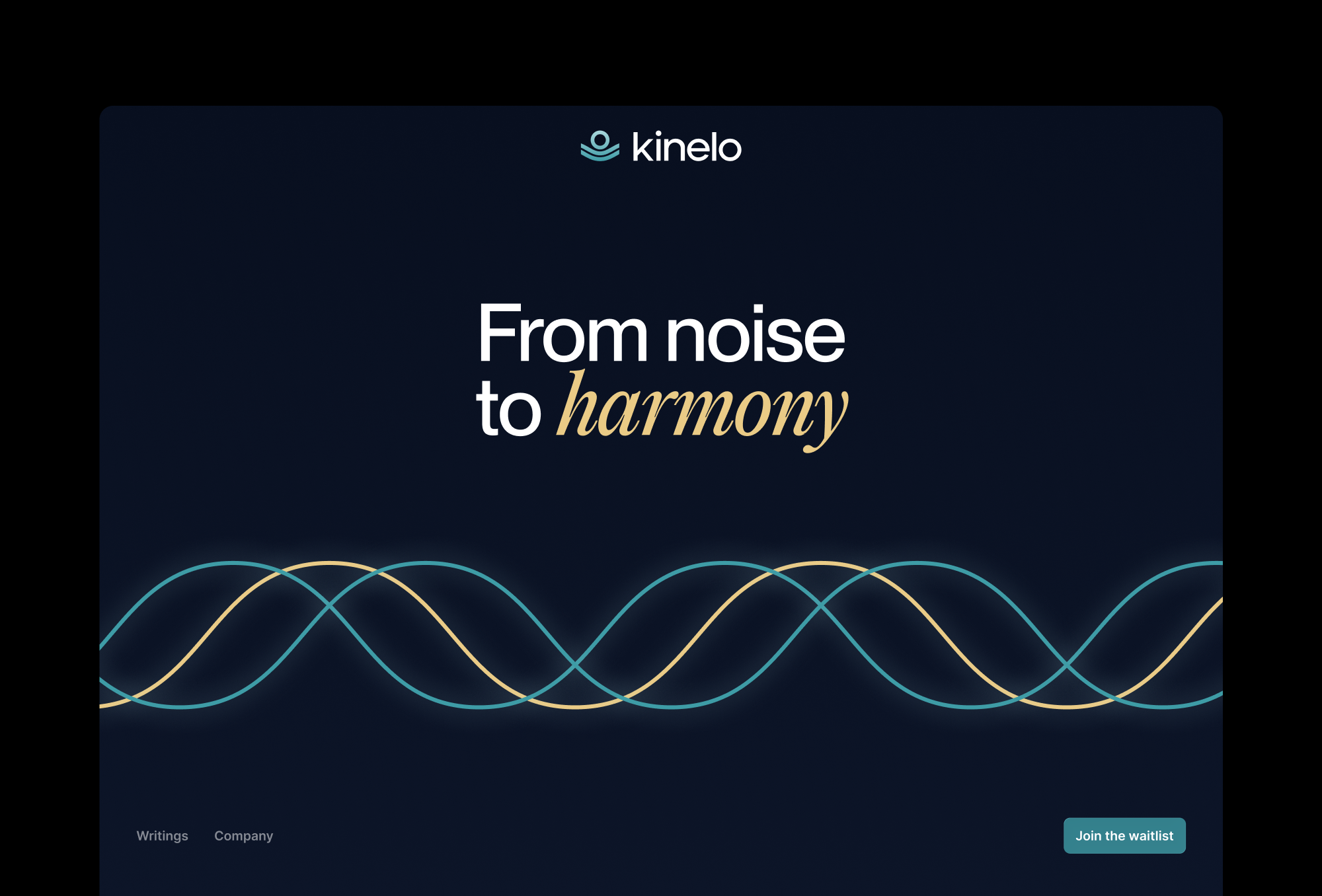
Brand Guidelines
This guide defines the visual language, design style, and principles that ensure a clear and consistent Kinelo brand experience—across teams, disciplines, and touchpoints.At its core, Kinelo is driven by clarity and care, reflecting our commitment to advancing breakthrough therapies for people living with immune-mediated diseases. These guidelines outline the visual and communication standards that bring our values to life and ensure Kinelo is expressed with purpose, consistency, and confidence.
01
Logo
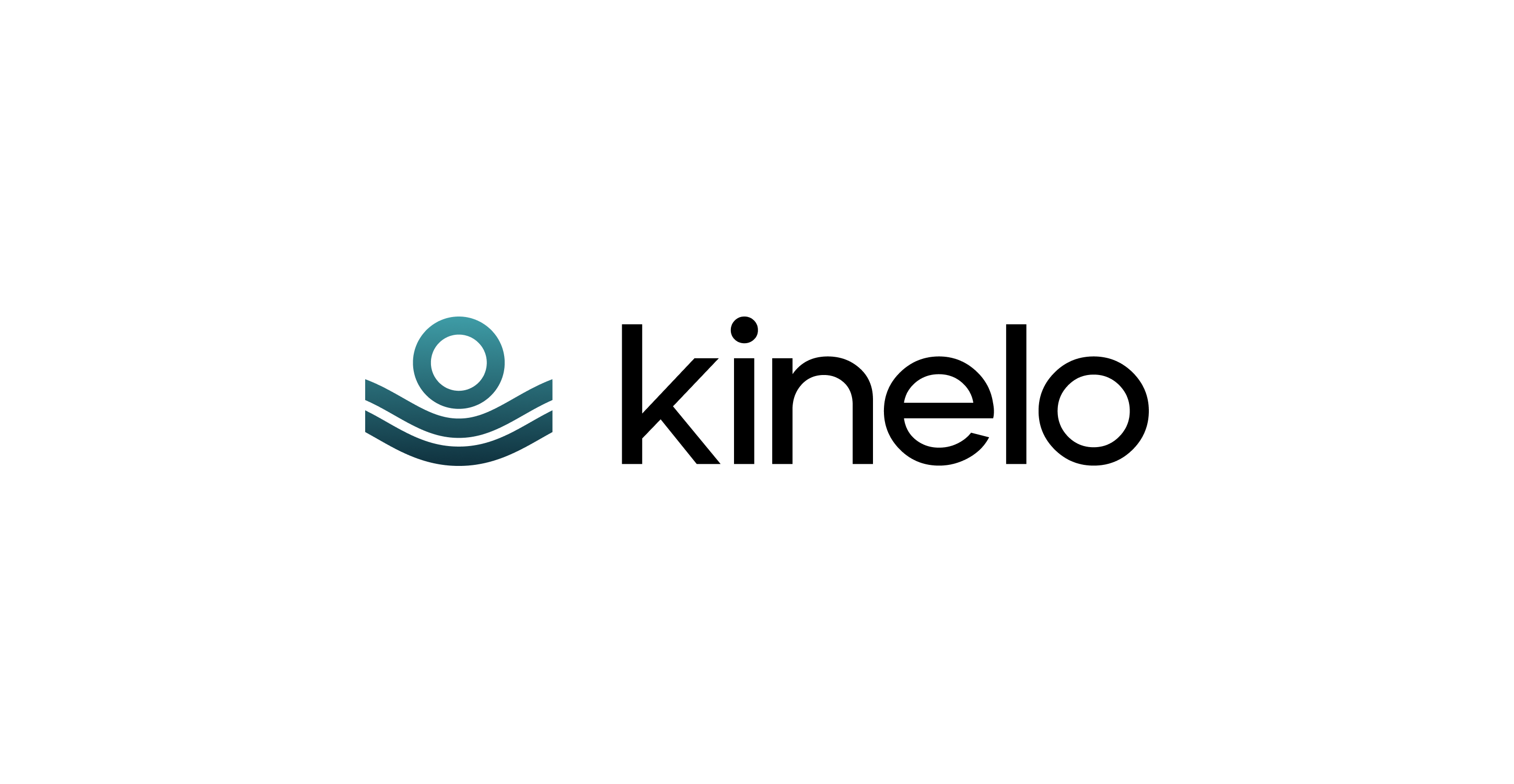
The Kinelo logo is formed by soft, flowing wave lines that bring gentle motion to a clean, simple mark. Its curves reflect the brand’s calming rhythm, creating a sense of clarity, harmony, and seamless continuity. Designed to feel warm, human, and intuitively approachable, the logo balances precision with ease, expressing Kinelo’s purpose with quiet confidence across every application.
1a
Primary Lockup
1b
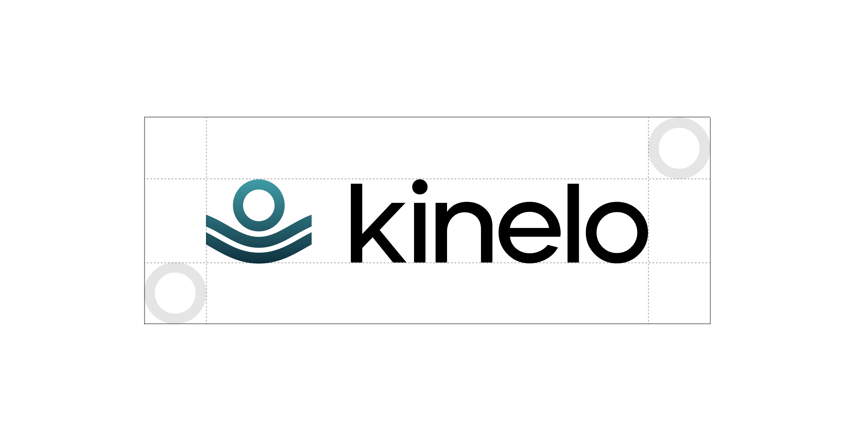
Clearspace
1c
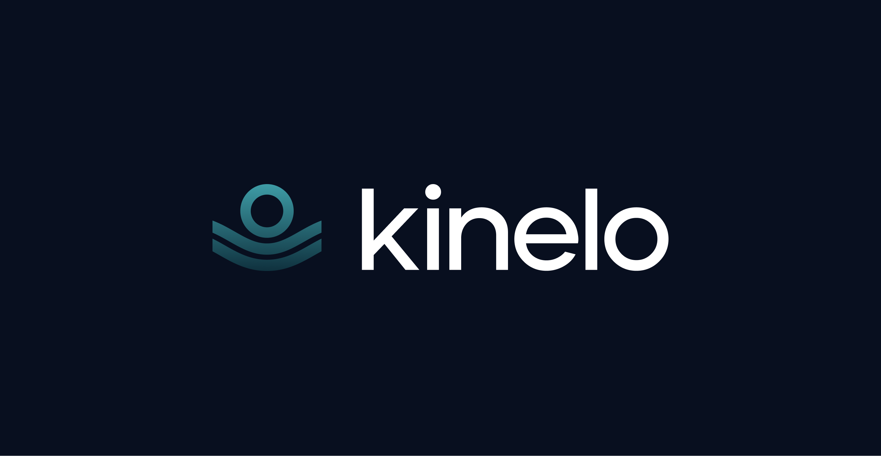
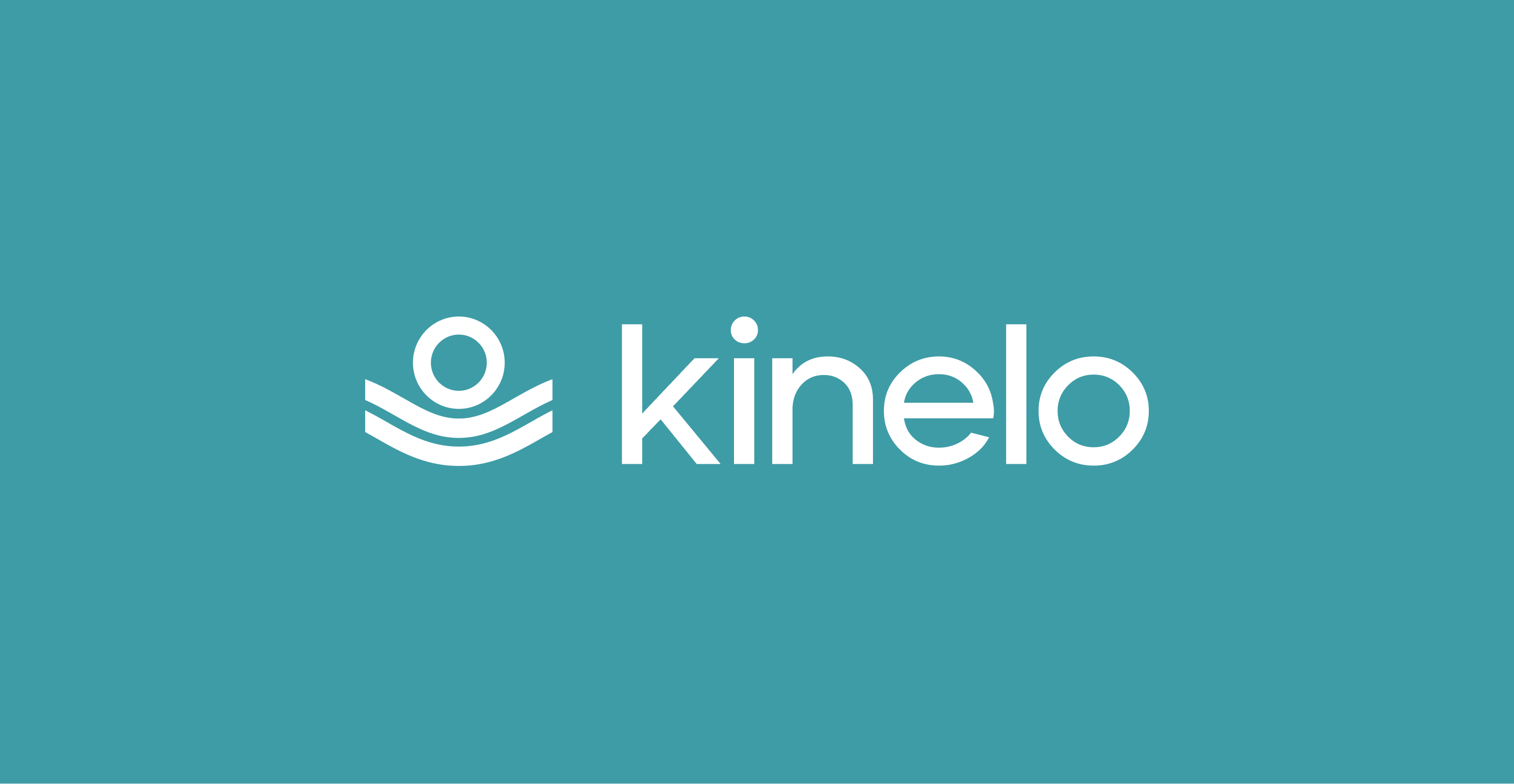
Secondary Lockups
1d
Incorrect Usage
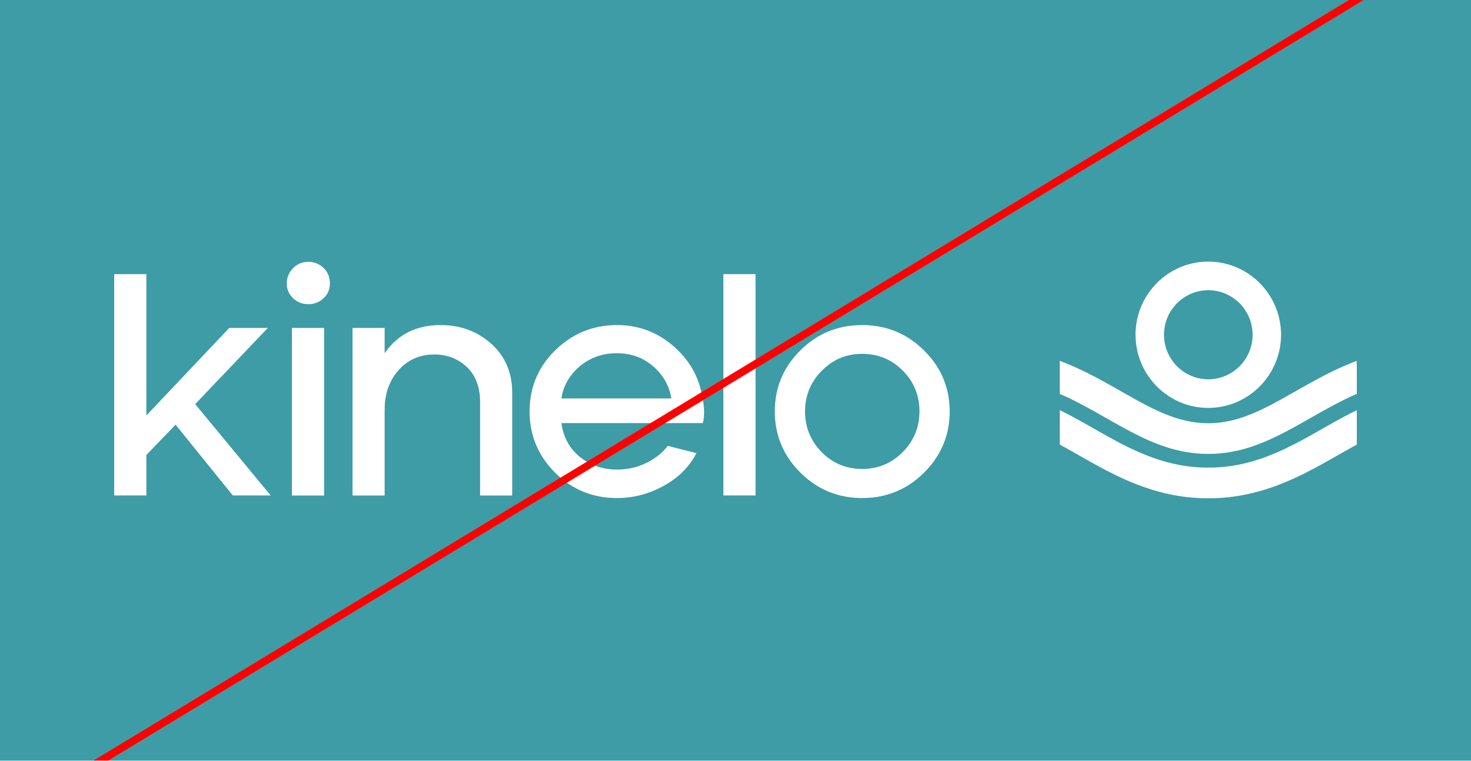

Don’t modify the order in the logo
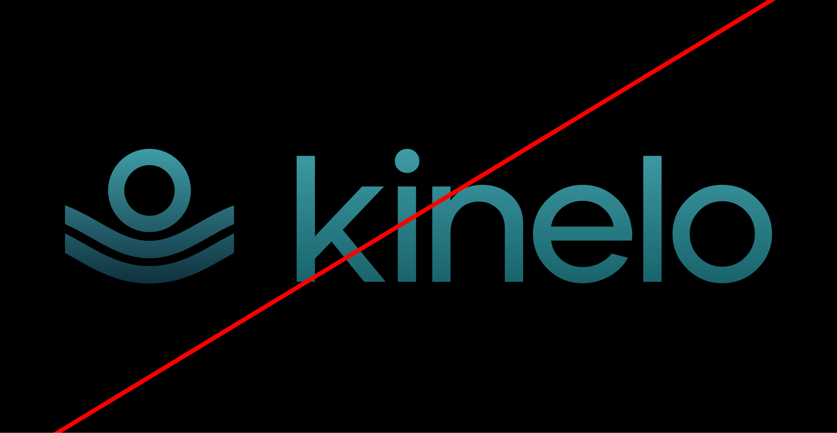
Don’t use gradients on the wordmark
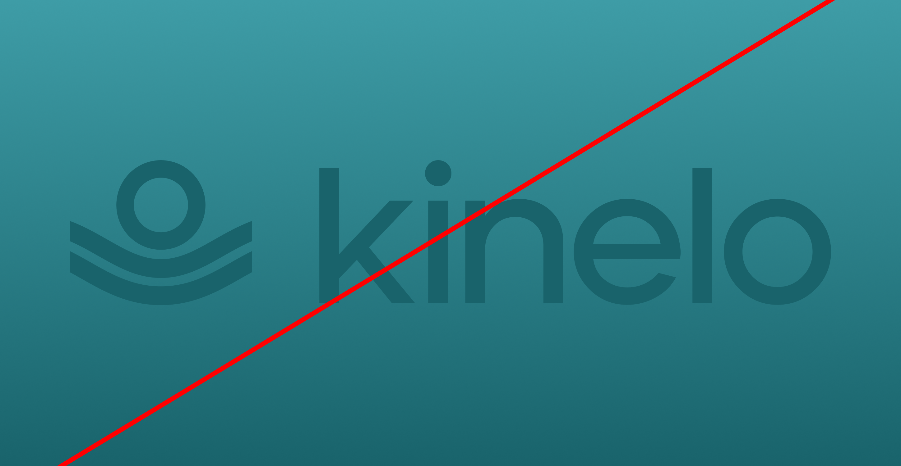
Avoid low contrast combinations
02
Color
Kinelo’s color palette is designed to feel grounded, balanced, and quietly confident. The primary colors establish a strong foundation—combining depth, warmth, and clarity—while the secondary palette adds flexibility and range across applications. Together, these colors create a cohesive system that supports legibility, hierarchy, and consistency, adapting seamlessly across digital and print experiences while reinforcing the brand’s calm, precise character.
2a
Primary Palette
Orange
Hex: #3E9CA6
Dark Blue
Hex: #080F1F
Gold
Hex: #C6EBF7
2b
Secondary Palette
Graphite Black
Hex: #232323
Pure White
Hex: #FFFFFF
Pure White
Hex: #FFFFFF
Graphite Black
Hex: #232323
2c
Gradient Palette
Gradient 1
Gradient 2
03
Typography
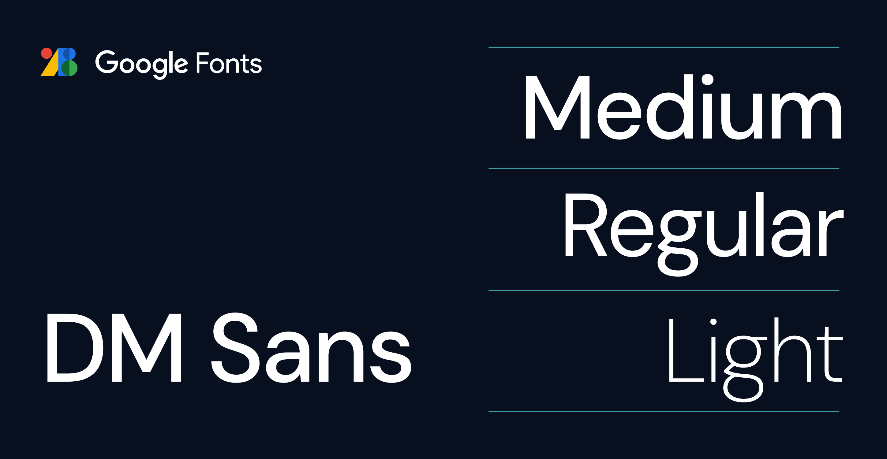
Kinelo’s typography is designed to feel clear, contemporary, and approachable. DM Sans serves as the core typeface, chosen for its clean structure, open forms, and excellent legibility across digital and print environments.
Download DM Sans from Google Fonts
04
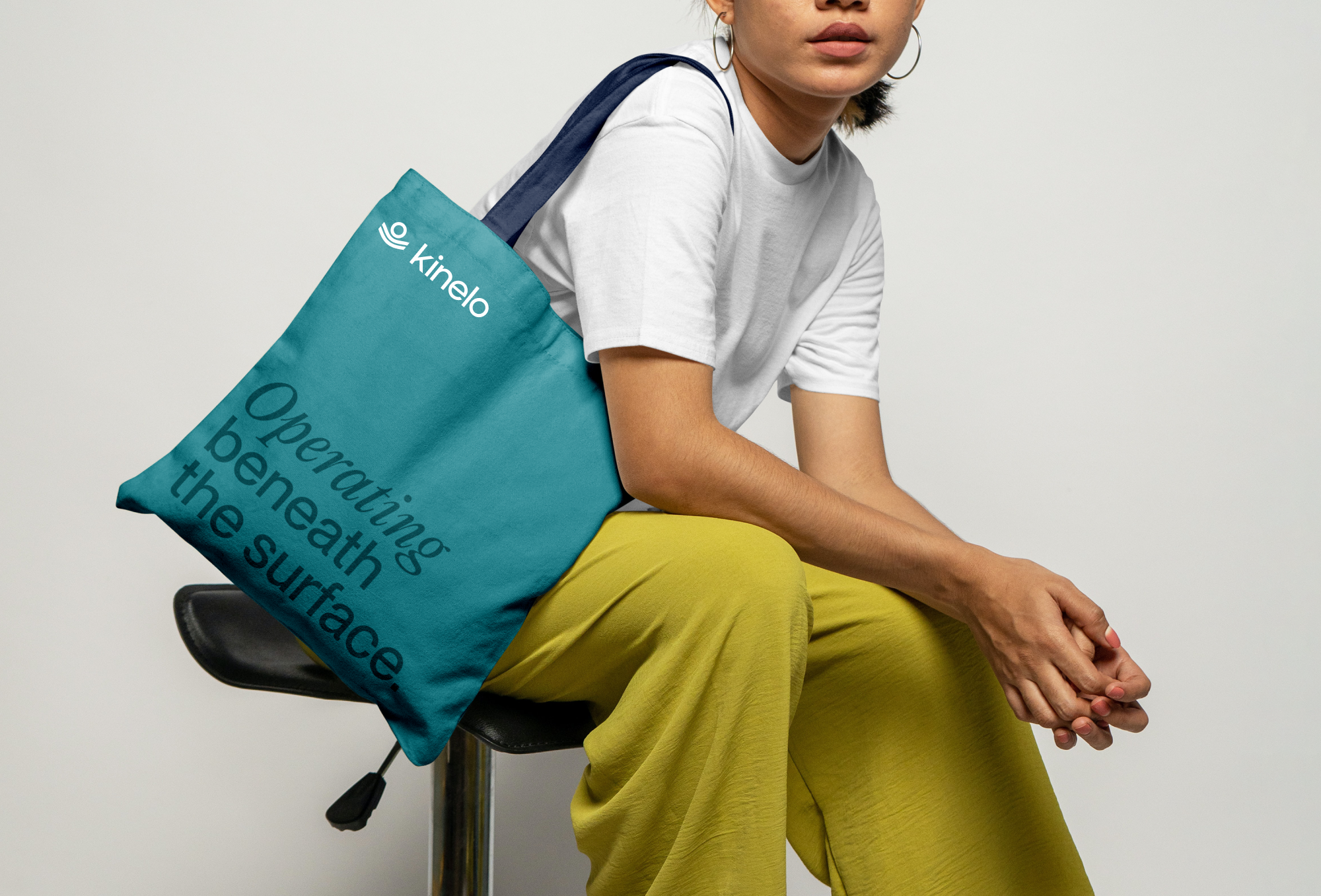
Putting it all together
When used together, Kinelo’s brand elements create a unified and compelling visual identity. Photography, layout, color, and typography come together to tell Kinelo’s story and move its mission forward with clarity and purpose.

Submit a Creative Request
Made with 💙 in Salt Lake City by Underbelly Creative.

Brand Guidelines
This guide defines the visual language, design style, and principles that ensure a clear and consistent Kinelo brand experience—across teams, disciplines, and touchpoints.At its core, Kinelo is driven by clarity and care, reflecting our commitment to advancing breakthrough therapies for people living with immune-mediated diseases. These guidelines outline the visual and communication standards that bring our values to life and ensure Kinelo is expressed with purpose, consistency, and confidence.
01
Logo
The Kinelo logo is formed by soft, flowing wave lines that bring gentle motion to a clean, simple mark. Its curves reflect the brand’s calming rhythm, creating a sense of clarity, harmony, and seamless continuity. Designed to feel warm, human, and intuitively approachable, the logo balances precision with ease, expressing Kinelo’s purpose with quiet confidence across every application.
1a
Primary Lockup
1b
Clearspace
1c
Secondary Lockups
1d
Incorrect Usage
Don’t modify the order in the logo
Don’t use gradients on the wordmark
Avoid low contrast combinations
02
Color
Kinelo’s color palette is designed to feel grounded, balanced, and quietly confident. The primary colors establish a strong foundation—combining depth, warmth, and clarity—while the secondary palette adds flexibility and range across applications. Together, these colors create a cohesive system that supports legibility, hierarchy, and consistency, adapting seamlessly across digital and print experiences while reinforcing the brand’s calm, precise character.
2a
Primary Palette
Orange
Hex: #3E9CA6
Dark Blue
Hex: #080F1F
Gold
Hex: #C6EBF7
2b
Secondary Palette
Graphite Black
Hex: #232323
Graphite Black
Hex: #232323
Pure White
Hex: #FFFFFF
Pure White
Hex: #FFFFFF
2c
Gradient Palette
Gradient 1
Gradient 2
03
Typography
Kinelo’s typography is designed to feel clear, contemporary, and approachable. DM Sans serves as the core typeface, chosen for its clean structure, open forms, and excellent legibility across digital and print environments.
Download DM Sans from Google Fonts
04
Putting it all together
When used together, Kinelo’s brand elements create a unified and compelling visual identity. Photography, layout, color, and typography come together to tell Kinelo’s story and move its mission forward with clarity and purpose.
Submit a Creative Request
Made with 💙 in Salt Lake City by Underbelly Creative.


Brand Guidelines
This guide defines the visual language, design style, and principles that ensure a clear and consistent Kinelo brand experience—across teams, disciplines, and touch points.At its core, Kinelo is driven by clarity and care, reflecting our commitment to advancing breakthrough therapies for people living with immune-mediated diseases. These guidelines outline the visual and communication standards that bring our values to life and ensure Kinelo is expressed with purpose, consistency, and confidence.
01
Logo
The Kinelo logo is formed by soft, flowing wave lines that bring gentle motion to a clean, simple mark. Its curves reflect the brand’s calming rhythm, creating a sense of clarity, harmony, and seamless continuity. Designed to feel warm, human, and intuitively approachable, the logo balances precision with ease, expressing Kinelo’s purpose with quiet confidence across every application.
1a
Primary Lockup
1b
Clearspace
1c
Secondary Lockups
1d
Incorrect Usage
Don’t modify the order in the logo
Don’t use gradients on the wordmark
Avoid low contrast combinations
02
Color
Kinelo’s color palette is designed to feel grounded, balanced, and quietly confident. The primary colors establish a strong foundation—combining depth, warmth, and clarity—while the secondary palette adds flexibility and range across applications. Together, these colors create a cohesive system that supports legibility, hierarchy, and consistency, adapting seamlessly across digital and print experiences while reinforcing the brand’s calm, precise character.
2a
Primary Palette
Kinelo Teal
Hex: #3E9CA6
Dark Blue
Hex: #080F1F
Gold
#DFEADC
2b
Secondary Palette
Graphite Black
Hex: #232323
Graphite Black
Hex: #232323
Pure White
Hex: #FFFFFF
Pure White
Hex: #FFFFFF
2c
Gradient Palette
Gradient 1
Gradient 2
03
Typography
Kinelo’s typography is designed to feel clear, contemporary, and approachable. DM Sans serves as the core typeface, chosen for its clean structure, open forms, and excellent legibility across digital and print environments.
Download DM Sans from Google Fonts
04
Putting it all together
When used together, Kinelo’s brand elements create a unified and compelling visual identity. Photography, layout, color, and typography come together to tell Kinelo’s story and move its mission forward with clarity and purpose.
Submit a Creative Request
Made with 💙 in Salt Lake City by Underbelly Creative.